This week, Kairos Design is revisiting the award-winning work we did for The Macula Foundation. We updated their brand identity and re-designed their website, and created a powerful online presence for the foundation by focusing on UX design.
Our team eventually took home the 2018 Gold Muse Award for Web Design, a Star Award from CSS Winner, and we were featured twice on Adobe XD, once for ‘Interaction’ and again in the ‘UX Design’ category.
Today, Sean Kim, founder and creative director, is answering questions on how the team worked together behind the scenes to translate The Macula Foundation’s important mission into an impactful and multifaceted website.
What is the rough outline of the Kairos Design process when taking on a multifaceted project like this?
We had two major projects for The Macula Foundation – the first was the logo and branding identity, and the second was creating the website for those users. Our team always starts by identifying not just the business or the business’s goals, but we instead focus more on identifying who the target audience is, and what the brand and digital user experience will mean to those audiences.
We identify these consumers not just on their demographic, but on a psychographic level as well. Once we figure out what their journey is like and what this experience will be for those audiences, and then we come up with a solution. In short, we keep that user experience in mind as a priority for both the branding and the web design.
What are the biggest things to keep in mind when building a brand, like KD did here?
When it comes to branding, the most important thing is identifying the users and their mindset. In terms of the business, how do you want to be seen and what kind of impact do you want to make on the users?
So Marty Neumeier once said (and I’m paraphrasing) that branding is the customer’s ‘gut feeling’ about a product or service. Trying to come up with and identify what that feeling is, and incorporating it into the tone, colors, typography… anything visual or having to do with the user’s experience is important when it comes to the brand. Then, you can strategically implement it across every channel of the process, including the touch-points and user experience.
(P.S. – If you’re new to branding, you can read a brief introduction here.)
Were there any new features added to the website during development? Why were these features important?
An important feature we try to focus on during web design is mobile responsiveness. So, depending on screen size, everything is optimized to fit whatever device the user is looking at. This is so that the website doesn’t look too cramped if you’re browsing on mobile or tablet, versus browsing the website via desktop.
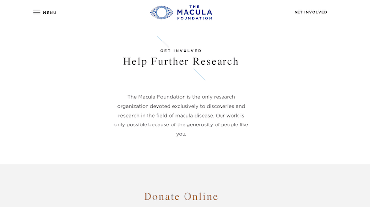
Another thing we focused on was the main call to action: donations. The Macula Foundation is a non-profit organization, so they rely on donors. Before we redesigned the website, it was super complicated to make a donation – at least from the user’s point-of-view. They had to remember to make the donation, write a check, mail it, and the recipient at the Foundation had to collect it and make a deposit – so it was a long process. By adding the option for online donations, we turned contributing into a modern, streamlined process.
What are the most important design and/or UX elements that Kairos kept in mind when redesigning this website?
For this specific project, we kept the users of the website in mind throughout the entire process. Most of these users are relatively older, since the Foundation researches macular degeneration, and age is large factor in those who develop this condition. Making updates for these users was absolutely necessary. Knowing who our audience was, we focused primarily on design and user experience. We wanted the website to be very clean, and we wanted to prioritize UX design and remove unnecessary or low priority information. So instead, we focused on high priority information, and designed the website elements around that.
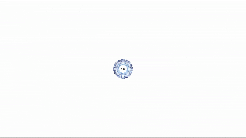
We would look at all the info we wanted to deliver, and mark this as high priority. In terms of font, graphic, colors, and creating more contrast – we used these elements to make the designs bigger and bolder with a simple and clean layout. If you see the website, starting from the main home page, you see the big image with the animation so you instantly know what this site is for and about.
Also, we have a bold tag line on every stage of the site, for clarification. You can’t miss the menu because of the placement, and when clicked, it shows you the full page menu. This feature is really important to a user friendly design.
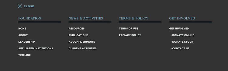
After UX design, the second point we wanted to emphasize for the Foundation was the ‘call-to-action.’ For this client, the most important call-to-action is asking for donations. So having ‘Get Involved’ in the top right corner of the homepage (which is hard to miss!) is one of the ways we were able to improve the site.
How would you describe the team mindset while working on this project? And how did you feel about receiving recognition for your work?
First and foremost, The Macula Foundation was referred to us by another client, so we were really grateful for the opportunity. Also, the founder of The Macula Foundation is a really well known professor and doctor in the ophthalmology industry, so it felt like a very prestigious honor to work with them.
Since this is a non-profit organization, it also just felt good to contribute – changing the branding, design, the website, and even the donation process really helped the foundation.
From an artist’s perspective, we were really excited to work on the project for The Macula Foundation because they gave us full freedom to explore new things and come up with solutions to existing user experience design issues. Being able to try different technical features and layouts for this specific audience type was interesting, and we were able to really get creative with our solutions.
The team worked on this project for about four months, and collaboration was very streamlined. So, Danielle was the project manager for this case at the time, and she helped me bring in the assets and communicate with the clients. She collaborated with me on designing every step of the process, so it was very helpful to have that kind of teamwork.
On the recognition our work received – it’s always really nice to feel rewarded for a job well done. We received a Muse Creative Award for Web Design, we were featured on Adobe a few times, and were recognized with a Star award as well. All these awards really just inspired us to start aiming for even more prestigious recognition! One day, we’ll be an Emmy award winning agency… one day!
Want more? Read our case study on the work we did for The Macula Foundation here.
Seeking to elevate your business with great branding and digital presence? Contact us for a free consultation today!
Leave a Reply
You must belogged in to post a comment.